HOUSECALL PRO
Software company for home service professionals
Role: Creative director (research, UX/UI design, branding, website, events, advertising material, editorial)
Led a team of 8 people (2 designer, 1 art director, 2 content writers and 2 videographers) and worked closely with a development team of 4 people.
—————
Overview
Housecall Pro is a cloud-based field service management app for service professionals to automate workflows and streamline technician dispatch. This solution includes a native mobile app and complementary web portal and serves a wide range of industries, such as carpet cleaning, window cleaning, plumbing, electrical, HVAC, and more.
As the team and the amount of products offered on the platform grew it became increasing important to create a system that was visually consistent and allowed the customer to consume the information easily.


Problem:
After sitting through a number of sale demos and feedback sessions with the customer, it was evident that Housecall pro needed a new design language across the web, marketing and product that spoke to their customer and provided a more consistent and intuitive experience.
Goals:
Design Goals: Appealing, intuitive design that resinated with the customer.
Business Goals: bring more leads and make the process more efficient.
Early feedback from customer:
“I’m not sure if the product is for me”
“I rather talk to someone”
“It doesn’t look genuine”
Solution:
Rebrand the company’s visual language and communication.
Strategies communication distribution and find solutions to reach the customer where they are.
Design a system to maintain consistency across all platforms.
Challenges:
Alignment: Making sure that the leadership team understood the needs and requirements of the customer, establishing goals and what are the necessary steps to take
Hiring: This wasn’t a one person job and the first step was to build a design team
Work priority: Prioritizing the work that helped moved the business forward while simultaneously implementing a new language and system. We wanted to make sure that as we were developing and implementing a new language that we aren’t hindering the work needed for the business to run and/or expand.
Agile work system: It was important to have a flexible work flow and to have the end user involved in the process of the redesign so we can get quick feedback and pivot if we need to.
Discovery:
GENERAL RESEARCH
Unprecedented territory
Lack of data
Very little research
Community not given much importance
GETTING TO KNOW THE USER
Proud of their craft
Hard working / Patriotic
Not tech savvy
Blunt and straightforward
Loved their trucks
Super busy
Competitive
Want recognition, sense of community
OPPORTUNITIES
Establish a new category in the industry
Valued authenticity
Use trucks for marketing
Social gatherings
Gamification
Use the customer to tell the brand story
Give them the spotlight
Looking for ways to save time on the business end
Values:
Brand values:
Authentic
Bold
Down to earth
Concise
Powerful
Uplifting
Design principles:
Intuitive . Consistent . Straightforward
Elements of design
Grid system:
Every measurement was spaced based on increments of 8.
Colors:

Typeface:

Icons:

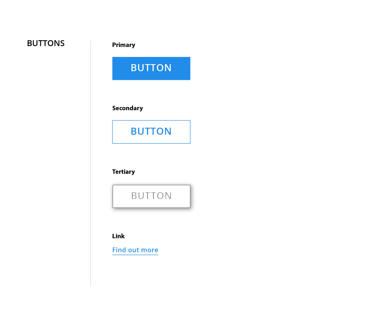
Buttons:
Tone and voice:

Photography and videography:

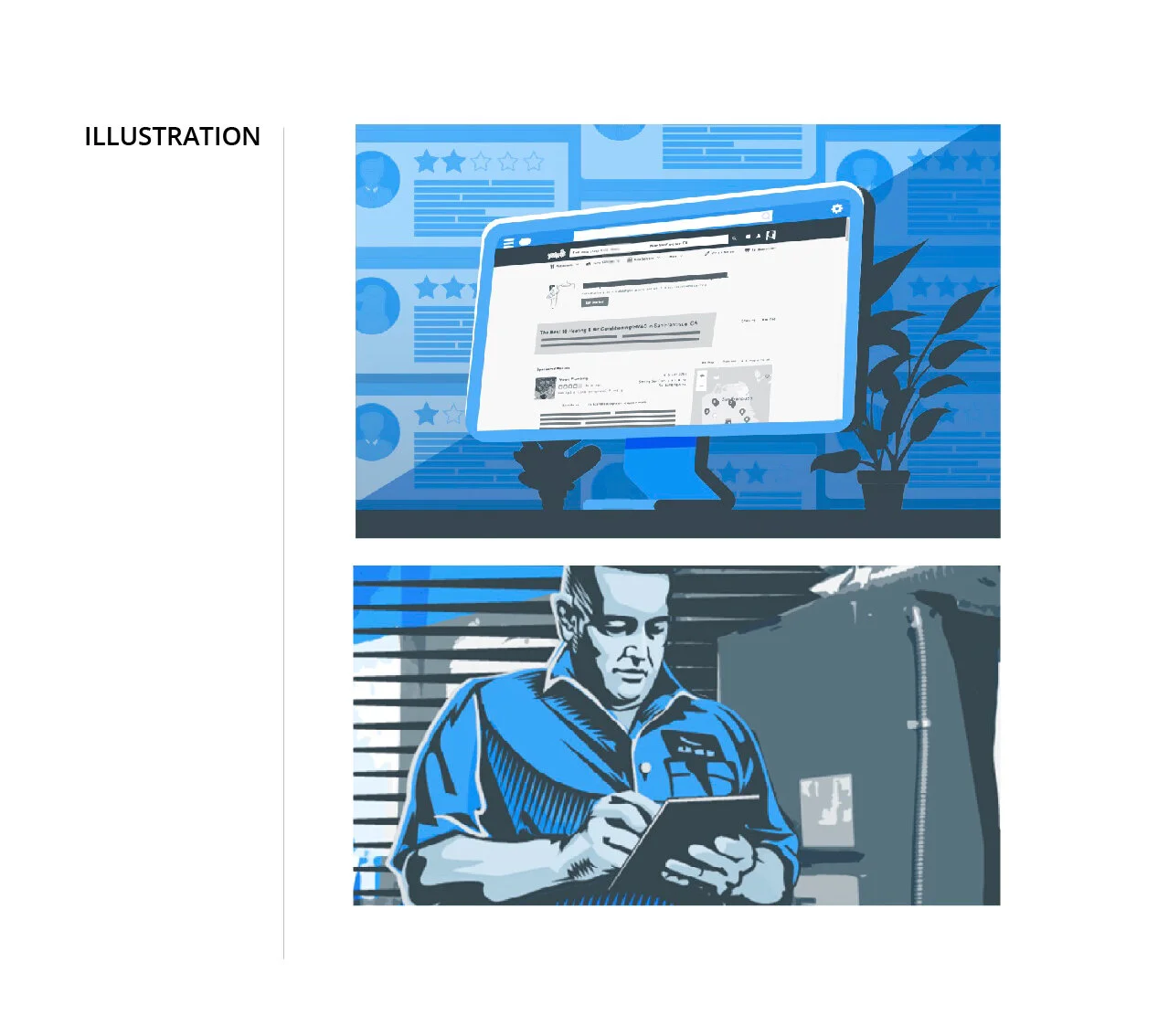
Illustrations:
Implementation:
Internal:
The components were initially collected and saved in a sketch master file, we also created a web link so the information was readily available to other users in the company. The efficiency and productivity of creating and iterating designs increased by 600% after setting up this system along side an agile workflow.
External:
We saw an heighten influx of our current and new customer inquiring about the product and referring it to other people.
Seeing the success of launching our new brand, it got picked up by our competitors.
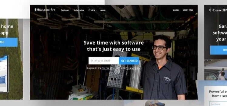
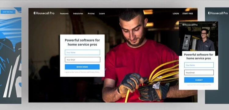
Ab testing:
A big part of determining whether the design was effective and met our goal was to AB test it. One example is the navigation bar we tried a few different versions before finalizing the current flow of information.